Type Form
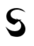
I picked the shanghai font by Primafont do to the symbolism that is behind the way letters are made and look. it is pointy on its edges but smooth on its strokes as it is written. It also has no size difference only to stand out and be bold in how it is written. It appeals to me since because of how it stands out and of how similar it is to me. i am not much of a outstanding person but i am bold in words and shatp in meanings.
Good find -- nicely stated.
ReplyDelete